This week in Design for the Non-Designer, we’re going to step away from the basics of Inkscape. We will perform a real-world task: restoring clean lines and edges to a pixelated logo. I discuss importing, bitmap tracing, node-editing, saving, and exporting in Inkscape. Special thanks to NJLLA for allowing me to use the task as an example for everyone!
67 of 365 Dance by Antoinette Marchfelder & John LeMasney via lemasney.com
67 of 365 Dance by Antoinette Marchfelder & John LeMasney via lemasney.com
This is a collaboration between Antoinette and I. Antoinette has a lovely drafting ability, and makes the most beautiful, colorful, jungle-inspired work. We’ve worked together in Inkscape, to help her expand her digital working style. In this case. I asked her if she had ever used a Wacom tablet, and she said that she had one, a small one. I brought out my lovely 24 inch Wacom, handed her the stylus, and she made this inspiring dancing figure you see above. I added the text below her illustration. We used an image of a lit match as the palette, and applied a range of tones from the very bright parts of the flame, to the darker smoky background. Fun work, and thanks Antoinette!
54 of 365 That thing gives me the creeps by John LeMasney via lemasney.com
54 of 365 That thing gives me the creeps by John LeMasney via lemasney.com
I was recently on a chat with a friend, and she explained that she really loved this breed of dog that has abundant wrinkles, very short legs, and clipped ears. The name of the breed escapes me, but my reaction was “that thing gives me the creeps”. I paused for a moment and thought about how odd that phrase is, which is usually a trigger for me to illustrate it. I pictured a 1970’s style treatment, dark, and playful.
In Inkscape, I placed the text, and applied the font Ballpark, a staple of my illustrations. I skewed the lines up and to the right. I duplicated and applied an outset to the duplicate, twice. Each time moving the outset shape backwards. I imported a lovely foggy image of red trees in summer morning, and used those colors for the palette.
I picture it being used in social media threads in which one person shares an image or idea that is full of creepiness, and someone shares my illustration as a response.
Advanced rotation in Inkscape by John LeMasney via lemasney.com
Advanced rotation in Inkscape by John LeMasney via lemasney.com
Let’s say you want to create a visual effect in which you have objects floating with regularity around another object, such as creating tick marks around the center of a clock. In this post, I’ll explain how you can do this easily in Inkscape. The key is in moving your center-point for the outer objects.
See the video below for a clearer explanation of these instructions. Open Inkscape. Using the text tool, create an ‘o’. Create a line with the bezier tool as your first tick mark. Put it in the perfect topmost position, aligned with the ‘o’ vertically. Click the tick mark with the selector tool until it is in rotation mode. Take the plus mark for the selected tick mark, and move it to the center of the o. This centers rotation at the center of the o. then, select the tick mark in rotation mode, and while dragging the rotation handle, hit your space bar at each place you want a tick mark. In 12 clicks of the space bar, you will be done.
I used to believe by John LeMasney via lemasney.com
I used to believe by John LeMasney via lemasney.com
I decided to illustrate a meditative thought I’ve had recently. There is a change emerging in my point of view, and I thought that I would express it in Inkscape. I added the text in two pieces, one for each line. I used Bebas Neue, one of my favorite title fonts. I tightened the kerning on an already very tightly kerned font, by breaking the text into individual letters and moving them horizontally towards each other until they had a certain flow. I spaced them on the non-repro grid on Inkscape that is set to 100 pixel squares. I added a texture in the background from an acid stained, coffee drenched sheet of ledger paper. I then re-aligned the lines of text to the blue ledger lines, and reduced the opacity of the letters to let the texture show through, as though they were printed as a ghost print in red ink. I think the text speaks to the treatment and the treatment speaks to the text.
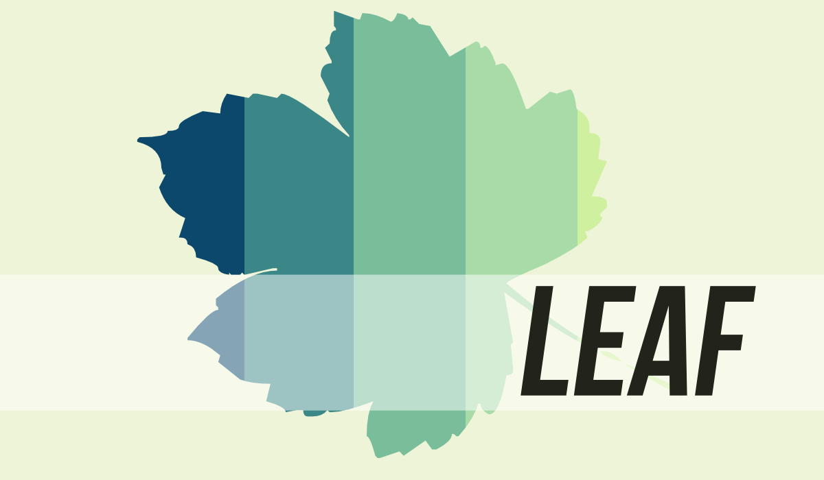
Leaf illustration by John LeMasney via lemasney.com
Leaf illustration by John LeMasney via lemasney.com
I saw a beautiful illustration on Pinterest that made use of clipping, and decided to play with the idea for myself. In Inkscape, if you import an image, like the palette in the illustration above, and make or import a shape, such as the leaf here, you can place the leaf shape on top of the palette image and apply object/clipping/set clip which results in the clipped image above. I added a rectangle in white, set transparency to 50%, and added the word leaf in one of my favorite fonts, Bebas Neue, and applied a skew.
It’s an interesting way to visually share two ideas in a single image. Both the palette and the leaf have their own visual message, and together they send an interesting combination of the two. I could have used a photograph instead to possibly make a statement about love or business or nature, or all three. Open up Inkscape and try this technique for yourself.
If you liked this post, please consider subscribing to this site by using the subscription form at the bottom of this page. Maybe Facebook is more your thing? Like our Facebook page at the bottom of this page. We’re also on Twitter, Google Plus, Pinterest, and other social networks listed at the top of this page. Please like, comment, and share if you found this post useful, interesting, or kind.


 Technology and the Arts – Ep. 63 (08.30.2013)

 Special webcast Monday, March 10, at 10 p.m. ET
 Technology and the Arts Special: Art All Night Trenton 2013