Categories
brand consulting curriculum vitae design principles Illustration insights portfolio teaching experience

4 of 365: Affordance #design #principle

4 of 365 - affordance - place setting by John LeMasney via lemasney.com
4 of 365 – affordance – place setting by John LeMasney via lemasney.com

Affordance is the design principle in which a designer considers the ease with which the user can make use of the design, in comparison to other solutions. A design with high affordance is valued because it makes more logical sense than other solutions. It allows for more understanding, and less misunderstanding. An example is a door with a handle on one side and a push plate on the other, in which the suggestion to pull is clear from one side and the suggestion to push is clear from the other. Another example is that both a round wheel and a square wheel will roll, but one clearly makes easier work of rolling. Good design that incorporates affordance considers the clarity and ease with which a task is done.

I recently attended a lovely lunch with a friend, and it seemed as though there was no design to the layout of the table, that anything could go anywhere. In learning about affordance, I thought that designing a placemat in which places were predetermined for the various dishes, drinks, and accoutrement would have been helpful. Since there is a shared central dish in the design, all of the places would be connected by it. The design could work in a round table, a long table, or a square table. By suggesting actions, the design considers affordance. In the same way that you can push on a handled door, you could place dishes anywhere on this place setting, but the most sensible action suggested by the design brings ease and order. This placemat would be reversible, in the event that a left handed person was seated.


Categories
affiliations professional activities professional experience references

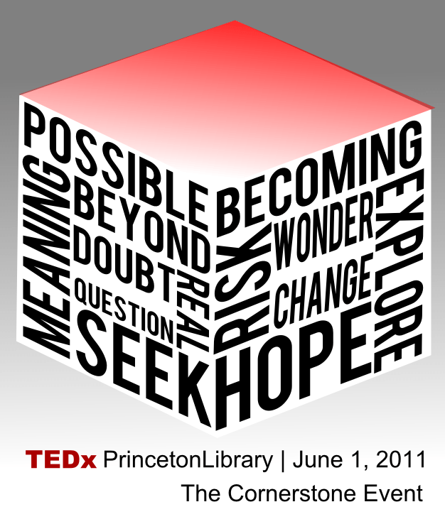
Event: TEDxPrincetonLibrary: The Cornerstone Event

TEDx Princeton Libraries by lemasney

June 1st, 2011: For a few months leading up to June, 2011, I was part of a team that came together to produce a TEDx event under the TEDxPrincetonLibrary brand. I was responsible for the web presence, graphic design and branding, and other technology related tasks. On the day, I was mostly responsible for setting up the stage for each speaker.

Categories
professional activities professional experience references teaching experience technology

LILRC: Graphic Design Best Practices

Hold on! by John LeMasney via 365sketches.org

Event: LILRC presents Graphic Design Best Practices

Date: April, 2011

Venue: Farmingdale State College

Details: LILRC site

Abstract: In this workshop on the basics of visual design best practices, we’ll examine examples and counterexamples of great design, the basics of layout, simplified color theory, rules for fonts and legibility, images and photographs, designing stamps vs pages vs slideshows vs billboards, copyright and creative commons, and free and open source design tools (photo manipulation, illustration, layout, catalogs, and quick editors).

Presentation: https://docs.google.com/presentation/d/121kHFLhNGrP85vKdR5ti1tRFVzMbwRmboBRuzRLFg7A/edit?usp=sharing

Commentary and notes:

Categories
portfolio

184 of 365 is an eye test in #Inkscape #type #play

Eye test
Eye test

I just had a birthday, so maybe that has something to do with it, but my vision is not what it used to be. I spend a lot of time looking at computer screens, and usually at a high resolution, so I imagine it’s only a matter of time before I become bespectacled. I imagine I’ll forgo any contacts, and just do some  geek rimmed thing. At any rate, i notice a lot more quickly now when a certain effect is visually jarring, and this kind of thing does it for me — text that you can partly see, partly not, that is blurry in some places, and crisp in others. I first noticed it in “I’m sorry, I’m just a little sleepy” and wanted to try to push it a little here. Anyway, keep an eye out for me in glasses. I suggest it will be less than a year from now. B)

Categories
professional activities professional experience teaching experience

Metro: Graphic Design Best practices

open source jackpot
Image by lemasney via Flickr

“Class Description:

During this workshop on the basics of visual design best practices, we’ll examine examples and counter-examples of great design, the basics of layout, simplified color theory, rules for fonts and legibility, images and photographs, designing stamps vs. pages vs. slideshows vs. billboards, copyright and creative commons, and free and open source design tools (photo manipulation, illustration, layout, catalogs, and quick editors).

By the end of the program, you will:

* Find and evaluate web-based resources for great design
* Choose the best colors, layouts, fonts, and graphics for other design projects
* Respect copyrighted work by finding imagery and other materials that are freely and legally available
* Become inspired about your design projects
* Move beyond Word and Publisher to more sophisticated design tools”

from Graphic Design Best Practices – METRO Professional Development at Mon Nov 16 2009 23:26:02 GMT-0500 (EST) on

Presentation: https://docs.google.com/presentation/d/121kHFLhNGrP85vKdR5ti1tRFVzMbwRmboBRuzRLFg7A/edit?usp=sharing

Reblog this post [with Zemanta]
Categories
professional activities professional experience teaching experience

Design Best Practices

Rider tech training poster 2009
Image by lemasney via Flickr

Event: Highland Regional Library Consortium presents Graphic Design Best Practices

Date: Thursday, April 23rd, 2009, 9 am – 4:30 pm

Venue: Somerset County Library, Bridgewater, NJ

Abstract: In this workshop on the basics of visual design best practices, we’ll examine examples and counterexamples of great design, the basics of layout, simplified color theory, rules for fonts and legibility, images and photographs, designing stamps vs pages vs slideshows vs billboards, copyright and creative commons, and free and open source design tools (photo manipulation, illustration, layout, catalogs, and quick editors).

Presentation: https://docs.google.com/presentation/d/121kHFLhNGrP85vKdR5ti1tRFVzMbwRmboBRuzRLFg7A/edit?usp=sharing

Commentary and notes:

An attendee writes: “I learned so much at today’s workshop.  I appreciate learning about different sources for images and photographs.  I have never taken any type of design class, so some of the concepts you introduced were completely new to me.  I plan to follow up on many of the things that you said.  I liked the way you encouraged us when stating that designs are “ideological pathways” that include function, utility and beauty.  Frankly, the workshop was inspiring!  I plan to email you with questions as I go through activating some of the ideas and concepts that you planted in my head.  I also appreciate your passion about “sharing” with the use of open source.  I never really thought about open source as a different paradigm in American culture.   In addition, to getting the day off from work, your presentation helped to make my day.”

Reblog this post [with Zemanta]